---
title: Components
description: Browse available MDX components for Cloudflare docs.
image: https://developers.cloudflare.com/cf-twitter-card.png
---
> Documentation Index
> Fetch the complete documentation index at: https://developers.cloudflare.com/style-guide/llms.txt
> Use this file to discover all available pages before exploring further.
[Skip to content](#%5Ftop)
# Components
When you are [contributing to the Cloudflare Docs](https://developers.cloudflare.com/style-guide/contributions/), you can use our custom components to add additional formatting, such as buttons, tabs, and collapsible sections.
This guide shows you the basics of importing and adding a component to a page. Refer to each component page in this Style Guide to learn the specific props and requirements for each.
Our components are based on [Astro components ↗](https://docs.astro.build/en/basics/astro-components/) and are written in [MDX ↗](https://docs.astro.build/en/guides/markdown-content/), an extended version of Markdown. [Learn more about the Cloudflare Docs framework](https://developers.cloudflare.com/style-guide/how-we-docs/our-site/#site-framework).
## Add a component to a page
To add a component to a page:
1. Import the component to the page by adding this text directly below the [frontmatter](https://developers.cloudflare.com/style-guide/frontmatter/):
```
import { COMPONENT_NAME } from "~/components";
;
```
For example, if you were to add [the DashButton component](https://developers.cloudflare.com/style-guide/components/dash-button/) to the [Images getting started page](https://developers.cloudflare.com/images/get-started/), the top of the MDX file corresponding to that page would look like the following:
```
---
pcx_content_type: get-started
title: Getting started
products:
- images
sidebar:
order: 2
---
import { DashButton } from "~/components";
;
```
2. Add the component to the page by adding this text anywhere on the page you want the component to appear:
```
```
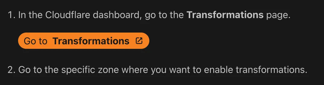
For example, if you were to add the `DashButton` component to some steps in the [Images getting started page](https://developers.cloudflare.com/images/get-started/), here is how the MDX file would look:
```
1. In the Cloudflare dashboard, go to the **Transformations** page.
2. Go to the specific zone where you want to enable transformations.
```
This is how this example would display after it is published:
## Choose the right component
To choose the right component for your use case, browse this table which contains our most commonly used components and a visual example of each. For full documentation on all available components and their use cases, browse the individual component pages in this Style Guide.
| Component | Description & visual example |
| ------------------------------------------------------------------------------------------------------ | ------------------------------------------------------------------------------------------------------------------------------------------------------------------------------------------------------------------------------------------------------------------------------------------------------------------------------ |
| [APIRequest](https://developers.cloudflare.com/style-guide/components/api-request/) | Styled API request block. Generate executable cURL API commands with the required API token permissions. 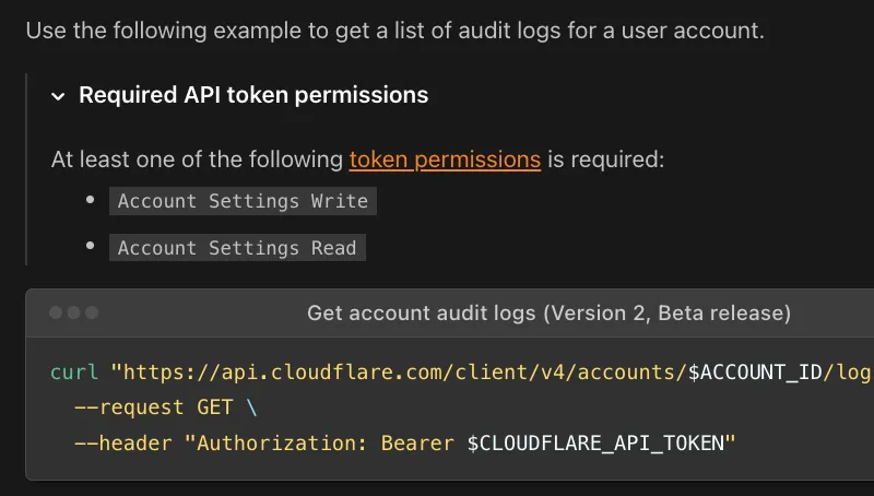 |
| [Badge](https://developers.cloudflare.com/style-guide/components/badges/) | Small descriptive pill. Label content with status, version, category, or other short metadata.  |
| [DashButton](https://developers.cloudflare.com/style-guide/components/dash-button/) | Dashboard deep-link button. Directly link users from documentation into a specific, relevant section of the Cloudflare Dashboard.  |
| [Details](https://developers.cloudflare.com/style-guide/components/details/) | Click-to-expand content block. Hide non-essential, complex, or advanced technical content, allowing users to expand the section when needed.  |
| [DirectoryListing](https://developers.cloudflare.com/style-guide/components/directory-listing) | Auto-generated sub-page list. Automatically generate a navigable list of links to sub-pages within a specified documentation folder path. 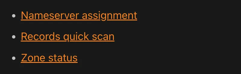 |
| [Feature](https://developers.cloudflare.com/style-guide/components/feature/) | Product feature list item. Highlight a product feature with a description and a direct link button. 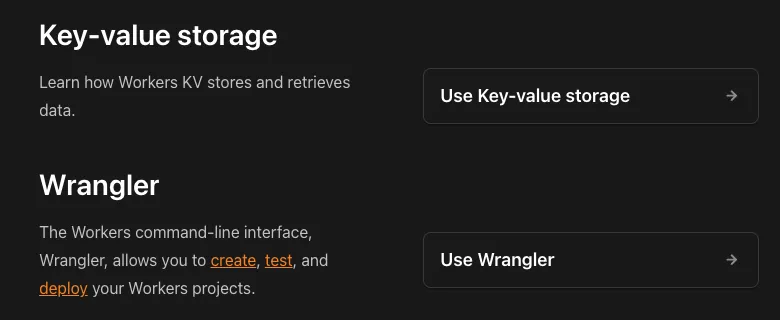 |
| [FeatureTable](https://developers.cloudflare.com/style-guide/components/feature-table/) | Product plan comparison table. Display detailed feature information, including availability across different Cloudflare pricing plans. 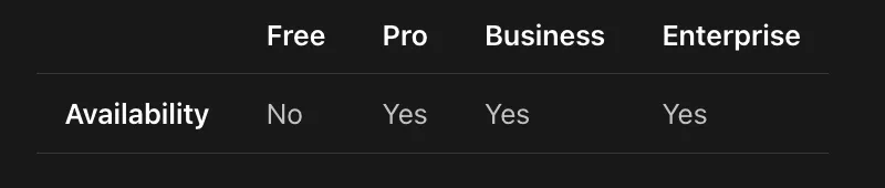 |
| [GlossaryTooltip](https://developers.cloudflare.com/style-guide/components/glossary-tooltip/) | Hover-activated glossary popup. Provide non-disruptive, hover-activated definitions for technical terms pulled from the documentation glossary. 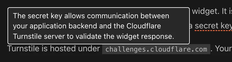 |
| [LinkCard](https://developers.cloudflare.com/style-guide/components/link-cards/) | Navigational cards. Present related tutorials, concepts, or guides in a visually engaging format. 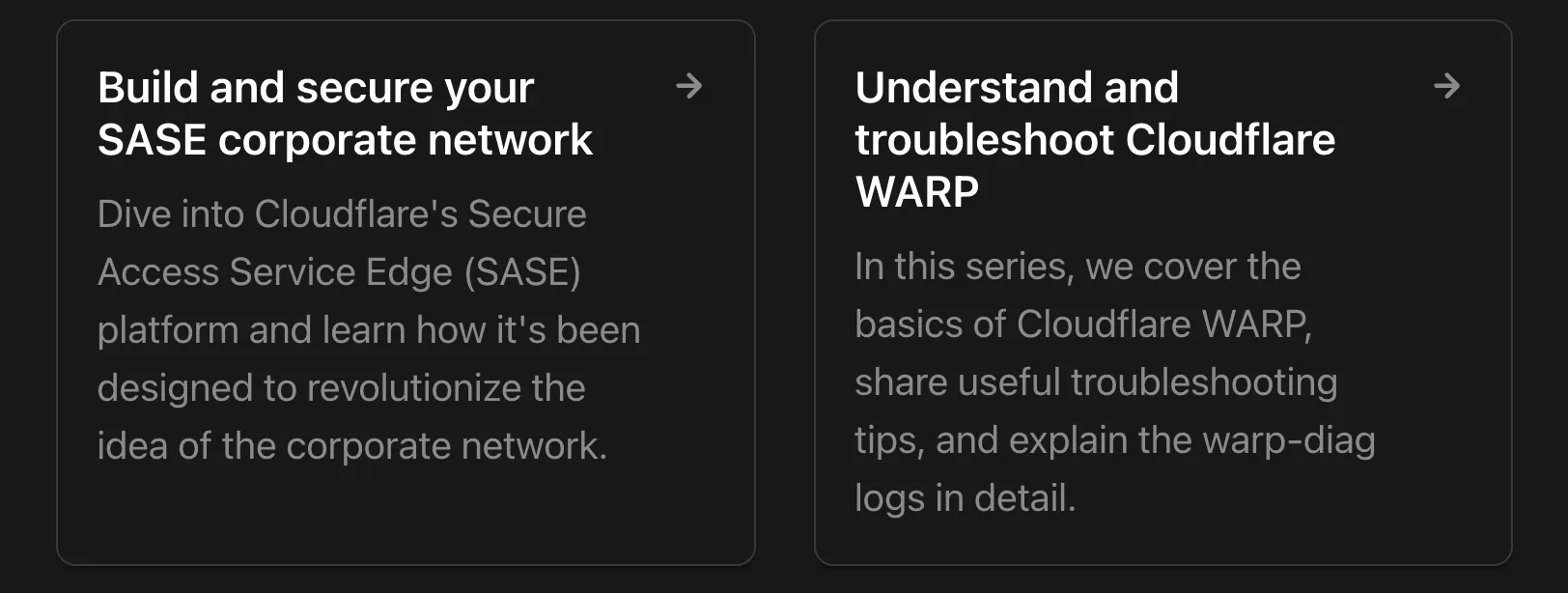 |
| [PackageManagers](https://developers.cloudflare.com/style-guide/components/package-managers) | Command switcher tabs. Display equivalent installation or execution commands for different package managers. 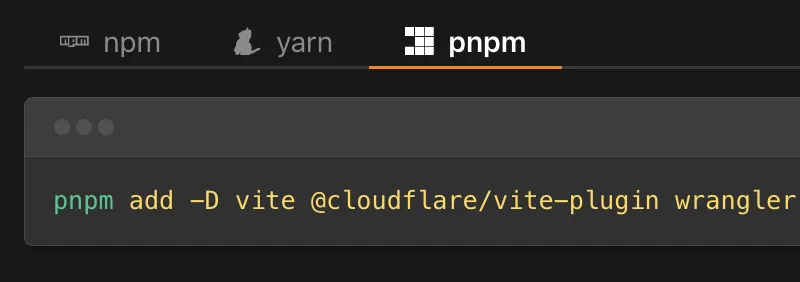 |
| [Plan](https://developers.cloudflare.com/style-guide/components/plan/) | Product plan availability badge. Show the plan required for a product or specific feature.  |
| [RelatedProduct](https://developers.cloudflare.com/style-guide/components/related-product/) | Formatted product reference. Visually highlight and link to a specific, complementary Cloudflare product, also featuring the product's logo. 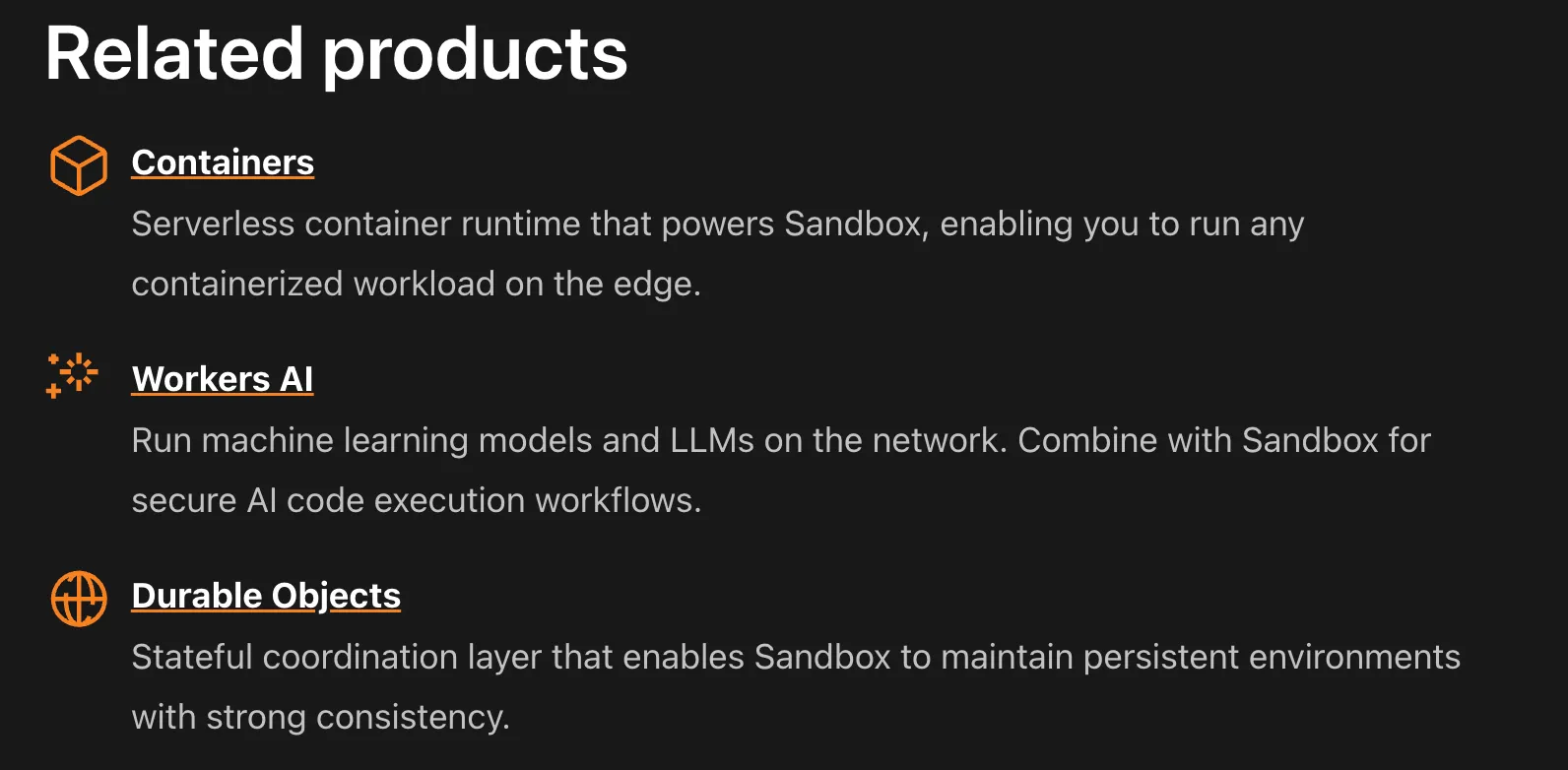 |
| [ResourcesBySelector](https://developers.cloudflare.com/style-guide/components/resources-by-selector/) | Filterable code example library. Pull and display lists of code examples and resources based on tags and content type. 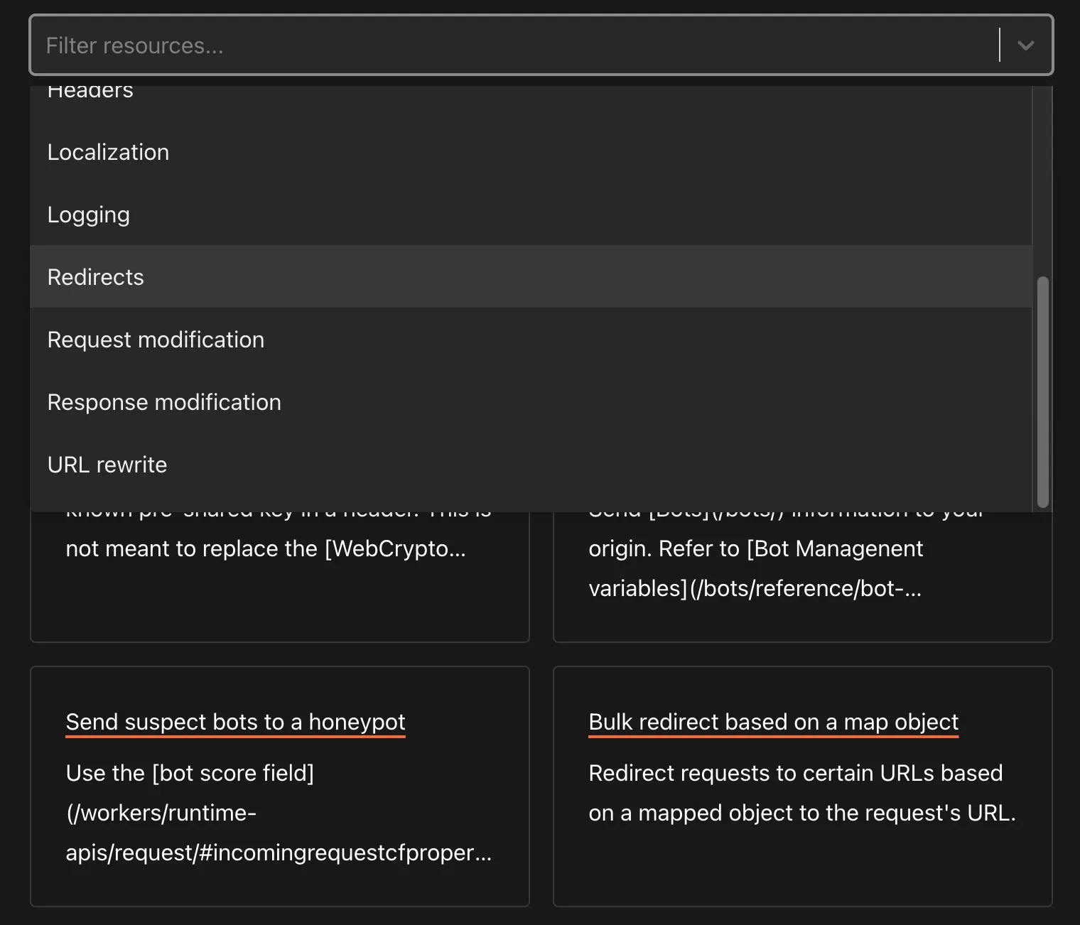 |
| [Stream](https://developers.cloudflare.com/style-guide/components/stream/) | Embeddable video player. Display a video player optimized for Cloudflare Stream.  |
| [Tabs and TabItem](https://developers.cloudflare.com/style-guide/components/tabs/) | Switchable content tabs. Allow easy switching between content views for different code languages or configuration methods. 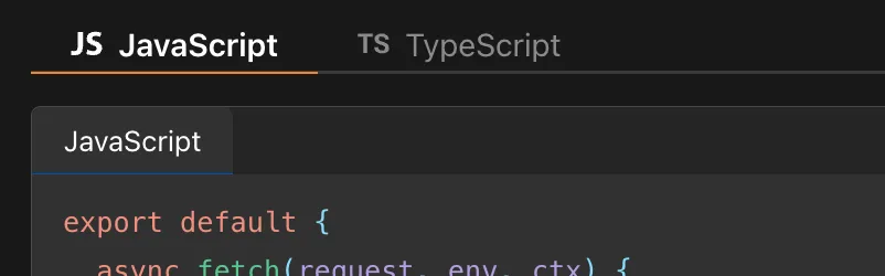 |
| [Type and MetaInfo](https://developers.cloudflare.com/style-guide/components/type-highlighting/) | Pill-shaped data type badge and metadata annotation about a field or property. Type indicates API parameter data types (String, Integer) and MetaInfo indicates metadata constraints (Required, Optional, Read-only). 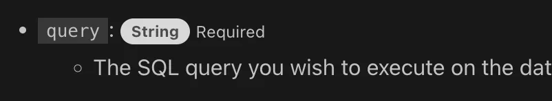 |
| [WranglerConfig](https://developers.cloudflare.com/style-guide/components/wrangler-config/) | Tabbed Wrangler config display. Show Wrangler configuration files (JSONC and TOML) and bindings with automatic format switching. 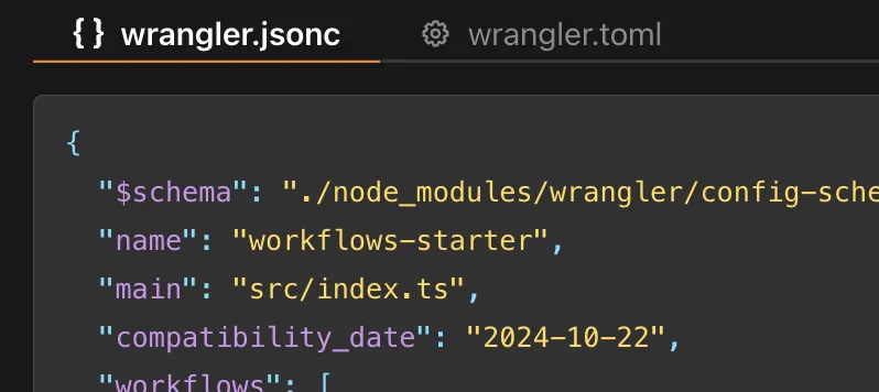 |
| [YouTube](https://developers.cloudflare.com/style-guide/components/youtube/) | Embeddable video player. Embeds a YouTube video player with a specified video ID.  |
```json
{"@context":"https://schema.org","@type":"BreadcrumbList","itemListElement":[{"@type":"ListItem","position":1,"item":{"@id":"/directory/","name":"Directory"}},{"@type":"ListItem","position":2,"item":{"@id":"/style-guide/","name":"Style Guide"}},{"@type":"ListItem","position":3,"item":{"@id":"/style-guide/components/","name":"Components"}}]}
```